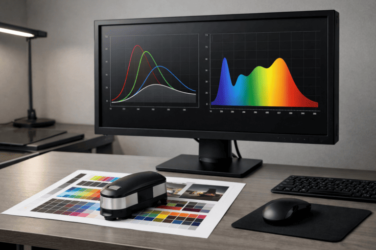
Reproducing paint colours in print is one of the hardest problems in commercial colour management. We’ve spent years developing the workflows, profiles and substrate knowledge to get it right.
“The swatch has to sell the colour. If the print doesn’t match the tin, the whole chain breaks.”
Colour
Precision
Paint is a physical product with optical properties that printed paper simply cannot replicate. Wet paint reflects light differently to dry. Gloss finishes behave differently to matt. Colours that look identical under daylight can diverge under artificial lighting. And the substrate you print on its whiteness, texture, absorbency and optical brightener content fundamentally changes how the printed colour appears.
Standard CMYK printing gets you in the right postcode. Getting to the right front door requires spectrophotometric profiling, controlled substrates, custom ICC profiles and an understanding of the specific failure modes that trip up paint colour reproduction. That’s our specialism.
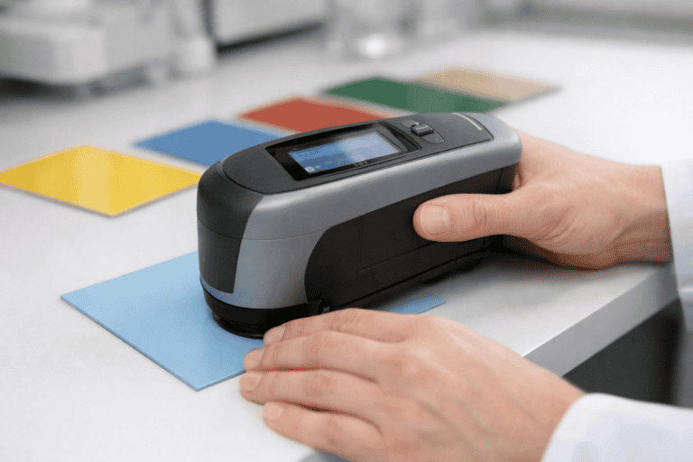
We start by measuring your physical paint samples using a spectrophotometer under controlled D65 illumination. This gives us objective colour data Lab values, spectral curves and reference coordinates — rather than relying on subjective visual assessment or reference numbers alone.
Using the measured data, we build custom ICC print profiles calibrated to your specific colours and the substrate on which they’ll be printed. We account for ink limits, dot gain, substrate influence and gamut boundaries to get as close to the target colour as the print process allows.
We produce spectrophotometer-verified colour proofs on the actual production substrate. You receive these with measured Delta E values against each target colour, so you can see precisely how close the printed output is before approving the production run.
Colour-accurate printed fan decks, chip cards and colour charts for paint ranges. Every chip spectrophotometer-verified against your master references.
Range brochures, colour selection guides and product literature where accurate colour representation is critical to the customer’s decision.
In-store colour browsing systems, wall-mounted displays and countertop sampling stations for decorative and trade paint retailers.
Colour reference materials for architects, designers and specifiers printed to the tolerances required for professional colour specification.
Delta E (ΔE) is the internationally recognised metric for colour difference. A ΔE of 1.0 is at the threshold of perceptible difference for most observers. A ΔE of 2.0 is noticeable on close comparison but still within acceptable limits for most commercial applications.
For paint colour matching, we target a maximum ΔE of 2.0 against your master reference measured under D65 illumination. Many of our production outputs achieve tighter tolerances than this, but we set the ceiling at 2.0 because anything beyond that point risks a visible mismatch between the printed swatch and the actual paint product.
Every proof we supply includes measured ΔE values per colour, so you have objective data to approve or query before production begins.
The problems we prevent before they reach your customers.
Many paper stocks contain optical brightening agents (OBAs) that fluoresce under UV light, shifting the perceived colour. We test substrates for OBA content and select stocks that minimise this effect for paint colour work.
Two colours that match under one light source but diverge under another. A constant risk in paint sampling. We assess metamerism risk for each colour and advise on profiles that minimise conditional matches across common viewing conditions.
Some paint colours particularly vivid reds, oranges and certain blues sit outside the reproducible gamut of CMYK print. We identify these upfront and discuss options: spot colours, extended gamut, or managed compromises with your approval.
Batch-to-batch variation in paper whiteness, thickness and surface finish creates colour shifts between print runs. We specify controlled substrate batches and hold reserve stock for multi-run programmes.
Matt paint on a gloss-coated swatch card will look different. Gloss paint on an uncoated stock looks flat. We advise on substrate and laminate combinations that most closely approximate the finish of the actual product.
Sampling tools displayed in showrooms under continuous lighting degrade over time. We use UV-resistant inks and advise on lamination and coating options to extend the working life of your colour references.
Our paint colour matching clients range from multinational coatings manufacturers to independent paint brands. What they share is a need for printed colour references that their customers and specifiers can trust.
Technical and practical answers for coatings manufacturers, paint brands and procurement teams.
Fan decks, swatch books and presentation systems for colour ranges.
Wide-format graphics with calibrated colour management.
In-store colour browsing displays and retail sampling systems.
Stock holding and distribution for colour sampling tools.
Send us your paint samples or colour references and we’ll produce spectrophotometer-verified proofs on your chosen substrate. You’ll see exactly what’s achievable before any commitment to production.