A wayfinding system is only successful if people do not notice it. When someone walks into a hospital, an airport, a university campus or a corporate headquarters and reaches their destination without confusion, hesitation or asking for directions, the wayfinding system has done its job. When people get lost, miss turns or feel anxious about navigation, the system has failed regardless of how attractive the signs look.
We manufacture and install wayfinding signage systems for commercial, healthcare, education, corporate and public environments. This guide covers the principles that make wayfinding work, the sign types involved, material considerations and the production process from design through to installation.
Key takeaways
- Effective wayfinding is a system, not a collection of individual signs every element must work together to create a continuous navigational experience from arrival to destination
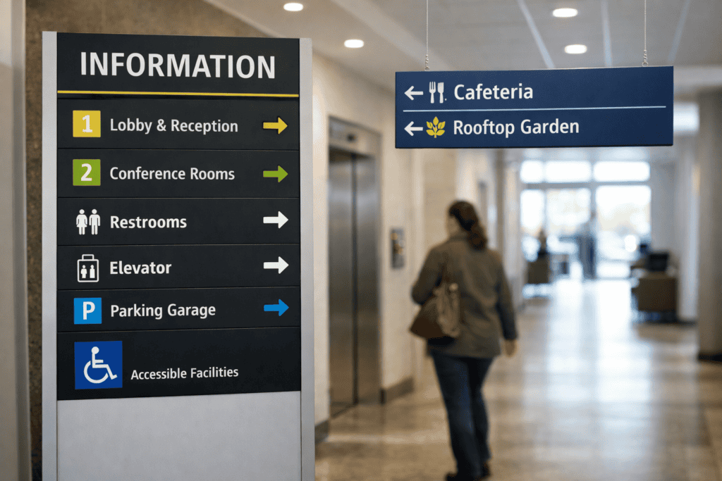
- The four sign types in a wayfinding system are identification signs (you are here), directional signs (go this way), informational signs (here is what you need to know) and regulatory signs (you must/must not do this)
- Legibility the ability to read text at the required distance is determined by letter height, contrast ratio, typeface weight and lighting conditions, not by sign size alone
- Modular sign systems with replaceable inserts allow content updates without manufacturing entire new signs critical for environments where room functions, tenant names or department structures change frequently
- Material selection for wayfinding signs balances durability, visual quality, update flexibility and budget across potentially hundreds of individual sign units
- Accessibility requirements (contrast ratios, tactile elements, Braille, mounting heights) are legal obligations under the Equality Act 2010, not optional enhancements
The Four Sign Types
Identification signs confirm where you are. Room nameplates, building names, floor numbers, department signs and reception desk identification all fall into this category. They answer the question “Have I arrived at the right place?” and provide reassurance that the navigation decisions made so far were correct.
Directional signs tell you which way to go. Corridor finger posts, wall-mounted directional panels, overhead hanging signs with arrows and external totem signs with destination listings all serve this function. They must be positioned at decision points junctions, intersections, lift lobbies, stairwell entries where the navigator needs to choose a direction.
Informational signs provide reference data. Floor directories, campus maps, building plans with “you are here” markers, opening hours, and department listings give the navigator context for their journey. They are typically positioned at entry points and major circulation nodes where people pause to orient themselves.
Regulatory signs communicate rules and safety information. Fire exit signs, no smoking signs, speed limits in car parks, and restricted area warnings serve legal and safety functions alongside navigational purposes. These are subject to specific BS and EN standards for dimensions, colours, symbols and positioning.
Legibility: Making Signs Readable
A sign that cannot be read at the required distance is functionally useless regardless of its design quality. Legibility is determined by four factors working together:
Letter height is the primary determinant. The standard formula is that uppercase letter height should be approximately 1% of the maximum reading distance. A sign intended to be read from 10 metres needs letters approximately 100mm tall. A room nameplate read from 2 metres needs letters approximately 20mm tall. This is a starting point actual legibility depends on the other three factors.
Contrast ratio between text and background determines readability under varying light conditions. Dark text on a light background (positive contrast) is generally more legible than light text on a dark background (negative contrast), though both work when the contrast ratio is sufficient. Low contrast (light grey text on white, or dark blue text on black) causes legibility failure in anything other than ideal lighting.
Typeface weight and style affect legibility at distance. Sans-serif typefaces with consistent stroke widths (Helvetica, Frutiger, Clearview) are the standard for wayfinding because they remain legible at the resolution limits of human vision. Decorative typefaces, condensed faces and ultra-light weights lose legibility faster with distance.
Lighting conditions at the sign location determine whether the inherent legibility of the sign is realised in practice. An internally illuminated sign in a dim corridor is legible around the clock. An externally lit sign depends on the lighting quality and angle. An unlit sign in a naturally lit space becomes illegible at dusk. For guidance on illumination options, see our guide to illuminated signage.
Modular Systems vs Fixed Signs
Wayfinding environments change. Departments relocate, tenants move, room functions are reassigned, and building layouts are reconfigured. A wayfinding system that requires manufacturing new signs for every change is expensive to maintain and typically becomes outdated because the cost and effort of updating discourages timely changes.
Modular sign systems address this by separating the permanent sign housing (the frame, mounting hardware and overall form factor) from the changeable content (the text, symbols and directional information). Content inserts are printed, engraved or digitally produced and slide, clip or magnetically attach into the sign housing. A room name change requires a new insert (minutes of production time, minimal cost) rather than a new sign (days of production time, significant cost).
Common modular systems include aluminium rail systems (extruded aluminium profiles with printed or engraved acrylic inserts), paper insert frames (simple frames with a printed paper insert behind a clear cover the most economical option for frequently changing information), and magnetic panel systems (flat sign faces with magnetic attachment, allowing quick replacement without tools).
For buildings with very high change frequency (hospitals, universities, multi-tenant offices), digital wayfinding displays are increasingly used for directory and directional information. These are outside our production scope but are often combined with physical signs for room identification and regulatory signage.
Material Selection for Wayfinding
Material choice for wayfinding signs balances four requirements: visual quality (the signs must match the architectural standard of the building), durability (wayfinding signs are permanent installations expected to last 10-20 years), update flexibility (the ability to change content without replacing the entire sign), and cost efficiency (a wayfinding system may involve 200-500 individual signs, so per-unit cost matters).
Aluminium is the standard material for professional wayfinding systems. It is lightweight, dimensionally stable, corrosion-resistant, accepts paint and print well, and can be extruded into modular profiles. Powder-coated aluminium in a specified RAL colour provides a consistent, durable finish across all signs in the system.
Acrylic is used for face panels, room signs and feature elements where transparency, colour depth or a premium surface finish is desired. Clear acrylic with reverse-printed or vinyl-applied text produces a high-quality appearance. For a comparison of sign letter formats, see our sign lettering guide.
For exterior wayfinding (campus signs, car park totems, directional posts), dibond (aluminium composite) provides the rigidity and weather resistance needed for freestanding and post-mounted installations.
Accessibility Requirements
The Equality Act 2010 requires that buildings and services are accessible to people with disabilities, which includes navigational signage. Specific requirements for wayfinding signs include tactile (raised) lettering and symbols on room identification signs, Braille positioned below the tactile text, minimum contrast ratio of 0.6 between text and background (measured using the Light Reflectance Value formula), matt or satin finishes to avoid glare that affects partially sighted users, and consistent mounting heights (typically centre of sign at 1400-1700mm above finished floor level) so that tactile signs can be located reliably.
BS 8300:2018 (Design of an Accessible and Inclusive Built Environment) provides detailed guidance on sign design, positioning and specification for accessible buildings. Compliance is not optional for public buildings, commercial premises and workplaces.
If you have a wayfinding project to discuss, brief us on your wayfinding requirements and we will advise on system design, materials, accessibility compliance and installation.
Frequently Asked Questions
How many signs does a typical wayfinding system involve?
It varies enormously. A small office building might need 30-50 signs. A hospital or university campus can require 500-2,000 individual signs. The quantity is determined by the number of decision points, destinations, rooms and regulatory requirements. We conduct a sign audit as part of the system design process to establish the scope.
Can you update existing wayfinding signs rather than replacing them?
If the existing system is modular (replaceable inserts), yes we can produce new inserts to fit the existing housings. If the existing signs are fixed (engraved, printed or vinyl-applied without a changeable mechanism), updating typically means producing replacement signs. We assess the existing system and recommend the most cost-effective approach.
Do wayfinding signs need planning permission?
Interior wayfinding signs do not require planning permission. Exterior wayfinding signs (campus totems, car park directional signs, building identification) may require advertisement consent depending on size, illumination and location. We assess the planning requirements for each exterior sign location as part of the project.
How long does a wayfinding project take?
A small system (50-100 signs) typically takes six to eight weeks from approved design to completed installation. Larger systems (500+ signs) may take twelve to sixteen weeks. The design and sign schedule development phase typically accounts for half the project timeline manufacturing and installation proceed relatively quickly once the specifications are finalised.
What about digital wayfinding screens?
We do not supply digital screens, but we regularly work alongside digital wayfinding providers. Physical signs and digital displays complement each other digital for frequently changing directory and directional information, physical for permanent room identification, regulatory signage and locations where screens are impractical or inappropriate.
Do you handle the design of the wayfinding system or just manufacture the signs?
Both. We offer complete wayfinding design (strategy, sign schedule, sign design, specification) as well as manufacture-only for clients working with a wayfinding consultant or interior designer. For larger projects, we typically collaborate with the project architect or interior designer to ensure the sign system integrates with the building’s design language.