If you work in paint manufacturing, colour specification, or any industry where printed colour must represent a physical product, you have encountered Delta E usually written as ΔE or dE. It is the standard metric for quantifying the difference between two colours, and it drives quality control decisions across printing, coatings, textiles, plastics, and display manufacturing. But despite its importance, Delta E is widely misunderstood, misquoted and misapplied.
As a specialist in paint colour matching and colour sampling production, we work with Delta E tolerances every day. This guide explains what the numbers mean, how they are calculated, what tolerances are realistic for different applications, and why a single Delta E number does not always tell the whole story.
Key takeaways
- Delta E is a single number representing the perceived difference between two colours the lower the number, the closer the match
- A Delta E of 1.0 is the approximate threshold of perceptibility for an average observer under controlled viewing conditions
- Different Delta E formulas exist (ΔE76, ΔE94, ΔE2000), and they produce different numbers from the same colour data always confirm which formula is being referenced
- For commercial print colour matching, a Delta E 2000 tolerance of 2.0 or below is considered a good match; below 1.0 is excellent
- Delta E does not describe the direction of the colour difference a reading of 3.0 could mean the colour is too red, too blue, too light or too dark
- Viewing conditions (lighting, background colour, observer angle) significantly affect perceived colour difference, independent of the measured Delta E value
What Delta E Measures
Delta E quantifies the Euclidean distance between two points in a three-dimensional colour space. The most commonly used colour space for this calculation is CIE L*a*b*, where L* represents lightness (0 = black, 100 = white), a* represents the red-green axis (positive = red, negative = green), and b* represents the yellow-blue axis (positive = yellow, negative = blue).
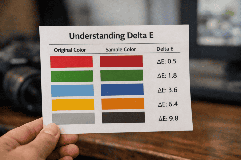
When you measure two colour samples with a spectrophotometer, the instrument records their L*a*b* coordinates. The Delta E value is the straight-line distance between those two points in the L*a*b* colour space. A Delta E of 0.0 means the colours are identical. As the number increases, the colours diverge.
The concept is analogous to measuring the distance between two points on a map. If point A is at coordinates (52.0, -1.5) and point B is at (52.1, -1.6), you can calculate the distance between them. Delta E works the same way, except the “map” has three dimensions (lightness, red-green, yellow-blue) instead of two.
The Perception Scale: What the Numbers Mean in Practice
The practical significance of Delta E values is often expressed as a perceptibility scale. The following thresholds are approximate and assume standard D50 viewing conditions with a neutral grey surround:
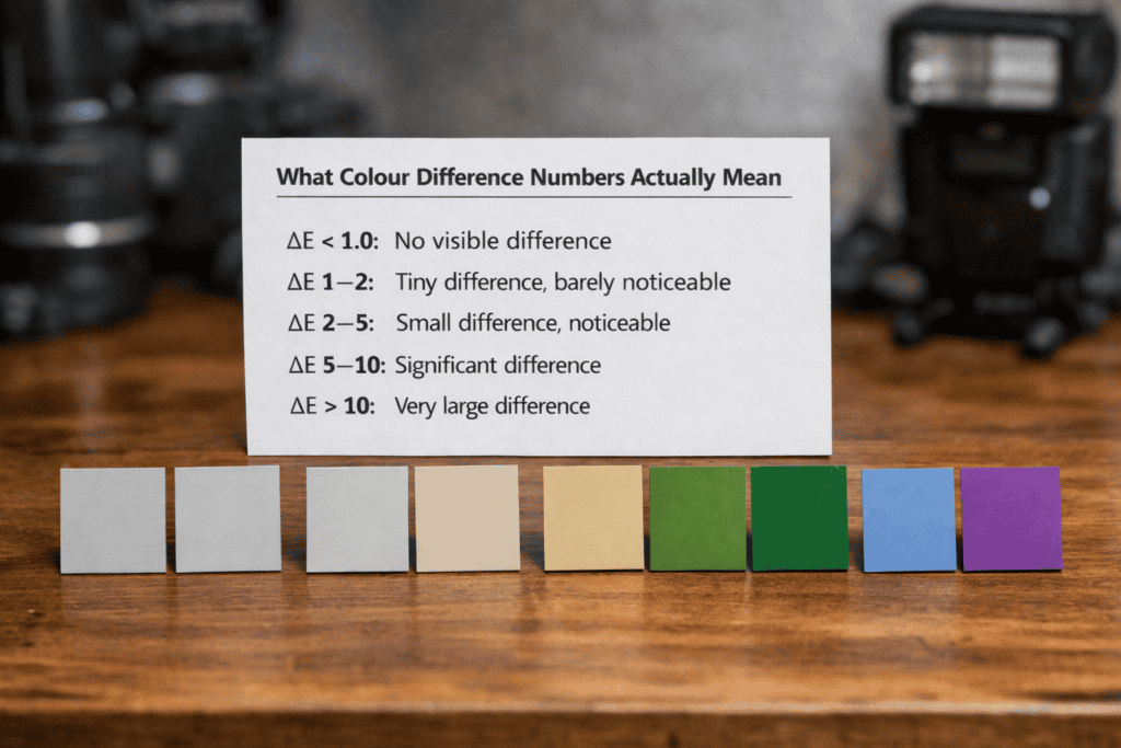
ΔE 0.0 – 0.5: Imperceptible difference. The two colours are visually identical to a trained observer under controlled conditions. This level of accuracy is achievable but requires exceptional process control and is not typically expected for commercial print production.
ΔE 0.5 – 1.0: Perceptible only to a trained observer making a direct side-by-side comparison. This is the target range for premium colour-critical work, including paint colour sampling, brand colour master references, and photographic proofing.
ΔE 1.0 – 2.0: Perceptible to an attentive observer but generally accepted as a good match. This is the standard production tolerance for commercial print colour matching and is the range most brand owners specify for printed colour collateral.
ΔE 2.0 – 3.5: Noticeable difference. An average person can see that the colours are different when placed side by side. Acceptable for many commercial applications but not for colour-critical work.
ΔE 3.5 – 5.0: Clearly different colours. Unacceptable for colour matching but may be tolerable for decorative or non-critical applications where exact colour reproduction is not the objective.
ΔE above 5.0: Different colours. No observer would consider these a match.
Delta E Formulas: Why the Version Matters
There is not one single Delta E formula there are several, and they produce different numbers from the same input data. The three most commonly encountered are:
ΔE76 (CIE76): The original formula, published in 1976. It calculates a simple Euclidean distance in L*a*b* space. It is still widely used because it is easy to calculate and well understood, but it has a known limitation: the L*a*b* colour space is not perceptually uniform, meaning that equal distances in different regions of the colour space do not correspond to equal perceived differences. A ΔE76 of 2.0 in the blue region looks different from a ΔE76 of 2.0 in the yellow region.
ΔE94 (CIE94): Published in 1994 as an improvement to ΔE76. It introduces weighting factors for lightness, chroma and hue that partially compensate for the non-uniformity of L*a*b*. It produces lower numbers than ΔE76 for the same colour pair, particularly for saturated colours.
ΔE2000 (CIEDE2000): The current best-practice formula, published in 2000. It applies five correction terms for lightness, chroma, hue, chroma-hue interaction, and a rotation term for the problematic blue region producing the closest correlation with human perception. It is the formula specified by most modern colour management standards, including ISO 12647 for print production.
When someone quotes a Delta E tolerance, always ask which formula they are using. A tolerance of “Delta E under 2.0” means very different things depending on whether it is ΔE76 or ΔE2000. If no formula is specified, assume ΔE76 (the most common default) and clarify before signing off on a quality standard.
Measuring Delta E: Instruments and Conditions
Delta E is measured using a spectrophotometer an instrument that illuminates a sample with a known light source and measures the spectral reflectance at each wavelength across the visible spectrum (380-730nm). The spectral data is then converted to L*a*b* coordinates using a standard observer function and a reference illuminant (typically D50 for print applications or D65 for coatings and textiles).
The measurement conditions matter as much as the instrument. Key variables include the illuminant (D50 vs D65), the observer angle (2° vs 10°), the measurement geometry (45°/0° vs diffuse/8°), whether the specular component is included or excluded, and the backing behind the sample (white vs black, which affects readings on translucent substrates).
Two spectrophotometers measuring the same sample can produce slightly different readings if they are using different measurement conditions. For colour-critical work, agree the measurement protocol with all parties before production begins instrument model, illuminant, observer, geometry and backing.
Delta E in Print Production: Realistic Tolerances
Every print process introduces variability. Ink density fluctuates during a print run, substrate batches differ slightly in whiteness and surface texture, and environmental conditions (temperature and humidity) affect ink behaviour. Achieving perfect colour match (ΔE 0.0) is impossible in volume production; the question is how close “close enough” needs to be.
For standard commercial digital print, a ΔE2000 of 2.0-3.0 across a production run is considered good performance. For colour-critical applications paint colour charts, brand colour swatches, product packaging matches a ΔE2000 of 1.0-2.0 is the target, achievable with calibrated equipment, profiled substrates, and controlled production conditions.
For our paint colour matching and fan deck production work, we target a ΔE2000 below 2.0 for every colour in the range, verified by spectrophotometer measurement against the client’s master reference. Colours that fall outside tolerance are reproduced until the target is met. This level of control requires custom ICC profiles for each substrate, daily press calibration, and batch-by-batch verification which is why colour-critical print costs more than standard commercial production.
Where Delta E Falls Short
Delta E is a powerful tool, but it has limitations that are important to understand:
It does not describe direction. A Delta E of 2.0 tells you the colours differ by that amount, but it does not tell you whether the printed colour is too red, too yellow, too dark or too light relative to the reference. For production control, you need the individual ΔL*, Δa* and Δb* components to diagnose and correct the deviation.
It does not account for metamerism. Two samples can show a low Delta E under the measurement illuminant (D50 in a spectrophotometer) and appear visibly different under shop lighting (fluorescent or LED). This is metamerism a spectral mismatch that instruments can detect but Delta E alone does not flag.
It does not capture texture, gloss or finish effects. A gloss-printed swatch and a matt-printed swatch of the same colour will measure differently and appear differently, but the visual difference is partly attributable to surface characteristics rather than colour alone.
It is context-dependent. A ΔE of 1.5 is imperceptible when two colour swatches are viewed separately in a fan deck. The same ΔE of 1.5 becomes visible when the swatches are placed edge to edge. The human visual system is far better at detecting colour differences in simultaneous comparison than in sequential or separated viewing.
How to Specify Delta E Tolerances for Your Project
If you are commissioning colour-critical print fan decks, swatch cards, colour charts, brand colour references here is a practical approach to specifying tolerances:
State the formula explicitly: “All colour measurements shall be assessed using CIEDE2000 (ΔE00).”
Set a realistic target: ΔE00 ≤ 2.0 is achievable for digital print on profiled substrates. ΔE00 ≤ 1.0 is achievable but requires tighter process control and may increase production time and cost.
Specify the measurement conditions: illuminant D50, 2° observer, 45°/0° geometry, white backing (or specify the conditions appropriate to your industry).
Provide a physical master reference: a measured reference sample for each colour, ideally with spectral data, is far more reliable than a digital file or a Pantone number alone.
If you need guidance on colour specification for a sampling or colour matching project, discuss a colour matching project with our colour team and we will advise on tolerances, measurement protocols and production approach.
Frequently Asked Questions
What Delta E is considered a good colour match in print?
For commercial print, a ΔE2000 of 2.0 or below is considered a good match. For colour-critical applications such as paint sampling and brand colour reproduction, a ΔE2000 of 1.0-1.5 is the target. For standard marketing collateral, a ΔE2000 of 3.0 or below is typically acceptable.
What is the difference between ΔE76 and ΔE2000?
ΔE76 is the original 1976 formula a simple Euclidean distance in L*a*b* space. ΔE2000 applies correction terms that better align with human perception, particularly in the blue region and at low chroma. ΔE2000 produces lower numbers than ΔE76 for the same colour pair. Always confirm which formula is being used when tolerances are quoted.
Can you achieve a Delta E of 0 in print?
Not in volume production. Every print process introduces some variability in ink density, substrate properties and environmental conditions. A ΔE2000 below 0.5 is achievable under tightly controlled conditions but is the practical floor for commercial production.
What instrument do I need to measure Delta E?
A spectrophotometer. Handheld devices such as the X-Rite i1Pro or Konica Minolta CM-26d are commonly used in print production. For laboratory-grade accuracy, benchtop instruments such as the X-Rite Ci7800 provide higher repeatability and more measurement geometry options.
Does Delta E account for gloss differences?
Standard Delta E calculations do not account for surface finish. A gloss sample and a matt sample of the same colour will produce different spectrophotometer readings, and the perceived visual difference will be partly attributable to gloss rather than colour. Some instruments offer separate gloss measurement capabilities to complement the colour data.
How does substrate affect Delta E results?
Substrate whiteness, surface texture, opacity and optical brightener content all influence the measured colour. The same ink formulation printed on two different substrates will produce different L*a*b* values and different Delta E readings when compared to a reference. This is why ICC profiles must be built and maintained for each substrate used in colour-critical production.