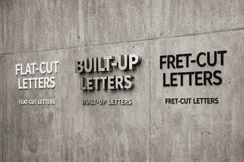
When specifying lettering for a fascia sign, building identification or interior wayfinding system, the choice between flat-cut, built-up and fret-cut letters determines the sign’s visual character, perceived quality, manufacturing cost, installation method and long-term durability. Each format has distinct advantages, and selecting the right one depends on the environment, the brand positioning, the viewing distance and the budget.
We manufacture all three letter types as part of our signage production service, so we can offer an objective comparison rather than steering clients towards whichever format happens to suit our production capabilities.
Key takeaways
- Flat-cut letters are cut from sheet material (acrylic, aluminium, stainless steel, foamex) and have no depth they sit flush against or slightly proud of the mounting surface
- Built-up letters are three-dimensional fabricated forms with a face, sides (returns) and back, creating a box-section letter that can house internal LED illumination
- Fret-cut letters are cut from a flat panel (aluminium composite, acrylic, timber) that remains attached to the surrounding panel, creating letters defined by negative space
- Flat-cut letters offer the best value for non-illuminated signage on flat surfaces, with clean lines and minimal visual weight
- Built-up letters are the premium option for illuminated signage, projecting quality and permanence that flat formats cannot match
- Letter size, viewing distance and mounting surface all influence the format decision there is no universally “best” option
Flat-Cut Letters: Clean, Simple, Cost-Effective
Flat-cut letters are produced by cutting individual letter shapes from sheet material using CNC routing (for thicker materials) or laser cutting (for metals and thin acrylics). The finished letters are single-thickness forms typically 3mm to 20mm thick depending on the material with no sides or depth beyond the material thickness itself.
Common materials for flat-cut letters include acrylic (available in hundreds of colours, glossy finish, lightweight), brushed or polished stainless steel (premium appearance, corrosion-resistant, heavy), powder-coated aluminium (lightweight, durable, any RAL colour), and foamex/PVC (economical, lightweight, suitable for interior use). Brass and copper are used for heritage and premium hospitality applications.
Flat-cut letters are fixed to the mounting surface using one of three methods: direct bonding (adhesive pads or structural adhesive for interior and sheltered exterior applications), stud mounting (threaded studs projecting from the letter back, pushed through pre-drilled holes in the mounting surface and secured with nuts behind), or stand-off mounting (the letters are spaced away from the wall on cylindrical stand-offs, creating a shadow gap that adds depth and visual interest).
Stand-off mounted flat-cut letters can be illuminated from behind using a concealed LED strip or projector module, creating a halo effect similar to built-up halo-lit letters but at lower cost. The effectiveness depends on the letter size, the stand-off distance and the colour of the mounting surface light-coloured walls produce a stronger halo than dark surfaces.
Built-Up Letters: Three-Dimensional, Illuminated, Premium
Built-up letters (also called fabricated letters or channel letters) are three-dimensional letter forms constructed from separate face, return (side) and back panels. The returns are typically 25-100mm deep, giving the letter a visible box depth that creates shadow, dimension and visual presence that flat formats cannot achieve.
Construction is typically aluminium returns with an acrylic face and aluminium back panel. The returns are formed by bending aluminium strip to follow the letter profile, then welding or riveting the strip to the back panel. The face is either a flat acrylic panel bonded to the front edges of the returns, or for higher-quality work a formed acrylic face that wraps around the return edges for a seamless appearance.
Built-up letters are the standard format for illuminated signage. The hollow interior houses LED modules that illuminate the face (face-lit), project light backwards onto the wall (halo-lit), or both (combined). Face-lit letters produce a glowing letter visible in daylight and dominant at night. Halo-lit letters create a dramatic backlight effect that works particularly well on architectural facades.
The manufacturing process is more complex and labour-intensive than flat-cut, which is reflected in the cost. Built-up letters typically cost three to five times more than equivalent flat-cut letters in the same size. The cost premium is justified when illumination is required, when the sign needs to convey premium quality, or when the viewing distance demands three-dimensional presence a 500mm flat-cut letter at 20 metres looks thin and insubstantial, while a 500mm built-up letter with 50mm returns reads clearly and projects authority.
Fret-Cut Letters and Logos
Fret-cut (also called through-cut or pierced) lettering involves cutting letter shapes through a flat panel, leaving the surrounding panel intact. The letters are defined by the cut-out shapes negative space rather than positive form. The panel material is visible around and between the letters, and the surface behind the panel (wall, window, or open space) is visible through the cut-outs.
This technique is used for fascia panels where the sign needs to be a single, unified element rather than individual letters. The panel provides a clean, bordered frame for the lettering and can be finished in any colour or material aluminium composite (dibond), powder-coated aluminium sheet, timber, Corten steel or acrylic.
Fret-cut panels can be backlit by mounting LED modules or strip between the panel and the wall. The light projects through the letter cut-outs, creating illuminated lettering within a dark panel surround. This produces a distinctive, architectural appearance that is popular for hotel signage, restaurant branding, corporate building identification and premium retail fascias.
The design must account for structural integrity thin strokes, small counters (the enclosed space inside letters like O, B, D) and fine serifs may not survive the cutting process or may be too fragile to maintain rigidity in the panel. Sans-serif typefaces with consistent stroke widths work best for fret-cut. If the brand typeface includes thin strokes or delicate features, we can advise on minimum sizes and any modifications needed to maintain structural integrity without compromising the brand identity.
Choosing the Right Format
For non-illuminated exterior signage on a budget: flat-cut aluminium or acrylic letters, stud-mounted, offer the best combination of clean appearance, durability and value. Suitable for building identification, unit numbering, directional signage and secondary brand applications.
For illuminated shop fascias and brand signage: built-up letters with face or halo LED illumination. The three-dimensional form, professional finish and illumination options justify the cost premium for any primary brand-facing sign. This is where most clients invest because the sign is the first thing customers see.
For architectural and premium hospitality signage: fret-cut panels in high-quality materials (Corten steel, brushed stainless, timber) with optional backlighting. The panel format suits buildings where the sign needs to feel integrated with the architecture rather than applied to it.
For interior wayfinding and room identification: flat-cut acrylic on stand-offs, or flat-cut vinyl letters applied directly to walls. Interior applications rarely need the depth or illumination of built-up letters, and the controlled environment means weather durability is not a factor.
For multi-site signage programmes, the format decision is made once during the brand specification phase and replicated across all sites. Consistency of manufacture is critical every letter across every site must match in dimensions, colour, finish and fixing method. We maintain tooling and material specifications from the original production run to ensure batch-to-batch consistency across programme timescales of months or years.
Materials, Finishes and Durability
The material choice determines the sign’s appearance, weight, weather resistance and lifespan. Acrylic is the most popular for illuminated and coloured lettering it transmits light evenly, is available in every RAL and Pantone colour, and can be polished to a high gloss. Aluminium (powder-coated, anodised or brushed) is the standard for weather-resistant exterior lettering and built-up returns. Stainless steel (brushed, polished or satin) is the premium material for corporate and heritage applications it resists corrosion, develops a distinctive patina in coastal environments, and conveys permanence.
Foamex and PVC are used for interior and short-term exterior applications where cost is the primary consideration. They are lightweight and easy to fix but they are not weather-resistant long-term and they lack the material quality of metal or acrylic. For temporary installations, event signage and interior wayfinding where the sign will be replaced within two to three years, foamex is a practical and economical choice.
Installation Considerations
Letter installation method affects both the visual result and the structural requirements. Direct-bonded letters are the simplest to install but provide no adjustment once placed precision is essential. Stud-mounted letters allow some positional adjustment during installation and provide a mechanical fixing that is more reliable than adhesive alone for heavy letters or exposed locations.
For building-mounted signage, the mounting surface must support the weight and wind loading of the letters. Rendered facades, curtain walling, composite cladding and glazing all require specific fixing strategies. We carry out structural assessments as part of the installation planning process, and where planning consent is required, we include fixing details in the application drawings.
If you have a lettering project to specify, discuss your signage requirements and we will recommend the right format, material and fixing method for your application.
Frequently Asked Questions
What is the minimum letter size for each format?
Flat-cut letters can be produced as small as 20mm height in acrylic and 30mm in metal, depending on the typeface complexity. Built-up letters have a practical minimum of approximately 150mm height due to the fabrication process the returns need sufficient depth to house the structure and any LED modules. Fret-cut letters depend on material thickness and stroke width, with a practical minimum of approximately 50mm height in 3mm aluminium composite.
Can flat-cut letters be illuminated?
Yes. Flat-cut letters on stand-off mounts can be halo-lit using concealed LEDs behind the letters. They can also be front-lit using external trough lighting or spotlights. However, face-lit illumination (where the letter face itself glows) requires built-up letters with a translucent acrylic face.
How long do exterior letters last?
Aluminium and stainless steel letters are effectively permanent 20 years or more with minimal maintenance. Acrylic letters last 10-15 years before UV degradation affects colour and clarity. Foamex letters are suitable for 2-3 years in exterior use. LED illumination typically lasts 10-15 years before modules need replacing.
What is the cost difference between flat-cut and built-up letters?
As a rough guide, built-up letters cost three to five times more than flat-cut letters in the same size and material. A set of flat-cut aluminium letters for a standard shop fascia might cost £300-£800, while equivalent built-up illuminated letters would cost £1,500-£4,000. The exact ratio depends on letter size, material, illumination type and quantity.
Can you match an existing typeface exactly?
Yes, provided the typeface is identified and available in vector format. We can match any standard or custom typeface. If the original font cannot be identified, we can recreate the letterforms from photographs or existing signage using vector tracing and manual refinement. Proprietary typefaces may require a licence for commercial reproduction.
Do you install the letters or just manufacture them?
Both. We offer manufacture-only for clients with their own installation teams, and manufacture-plus-installation as a complete service. For multi-site programmes, installation is managed centrally with our own teams or vetted regional installers working to documented quality standards.