ICC profiles are standardised files that tell printers, screens, and software how to translate colour data so output matches a defined reference. Without an ICC profile, the same red can appear crimson on a monitor and brick-orange in print. This article explains how ICC profiles work, why they matter for brand consistency, and what brand managers need to check before approving any colour-critical output.
Key takeaways
- Embed the correct ICC profile in every print file before you send it to a supplier.
- If a file is missing a profile, printers may assign generic defaults, which can shift reds orange and compress navy blues.
- RGB screens and CMYK presses cover different colour gamuts, and ICC profiles help bridge that gap.
- Request a proof, then measure it with a spectrophotometer against your Pantone or CMYK targets.
- Ask each supplier which ICC profile their press uses for your specified substrate.
- Store approved ICC profiles in a central location and name files by substrate and press type.
- Repeated colour drift across consistent artwork usually signals that the supplier’s RIP is overriding your embedded profile.
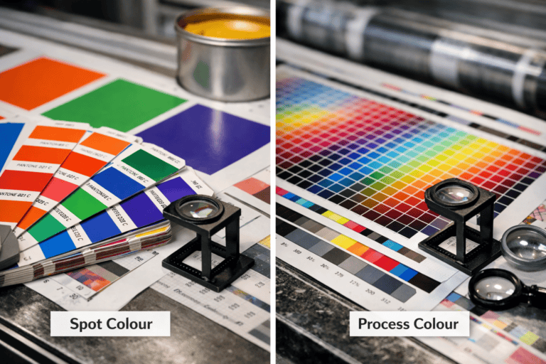
What an ICC Profile Actually Does to Your Brand Colours
Embed the correct ICC profile in every print file before you send it to a supplier. Without it, the printer’s software may assign a generic default. That can shift warm brand reds towards orange and compress deep navy blues.
An ICC profile is a small data file that maps your artwork’s colour values to the output capabilities of a specific device. It tells a printer or press how to interpret each RGB or CMYK value, so the result matches your intended colour. The International Colour Consortium standardised this format so colour data travels consistently across devices and software.
Screens emit light, while print absorbs it. The profile compensates for that difference at the point of conversion. Colour accuracy is measured using Delta E, where scores below 2 are imperceptible to the human eye. A missing or mismatched profile can push that score above 5, creating a visible difference on shelf.
Why Colours Shift Between Screen, Print, and Packaging
| Context | How colour is produced | Main risk to brand colour |
|---|---|---|
| Screen | RGB light emitted from the display | Can show vivid blues and greens that print cannot reproduce. |
| Print press | CMYK inks absorbed by the sheet | Out-of-range screen colours are compressed into the press gamut. |
| Packaging substrate | Ink behaviour changes by material | Kraft board, uncoated paper, and metallic film shift how the final colour reads. |
Screens emit light. Print materials absorb it. An RGB monitor builds colour from red, green, and blue light, while a CMYK press lays down cyan, magenta, yellow, and black inks. The two systems cannot reproduce identical colour ranges, or gamuts.
Displays can produce vivid electric blues and neon greens that lithographic ink cannot physically match. Without a calibrated ICC profile to bridge the two gamuts, the printer’s raster image processor compresses out-of-range values into whatever the press can manage. As a result, a brand colour that looked correct on screen can appear duller or colder on print materials.
Substrates such as kraft board, uncoated paper, and metallic film absorb ink differently, which shifts how the final colour reads. A profile built for a coated sheet produces noticeably different results on uncoated stock, even with an identical ink mix. Specifying the correct output profile for each substrate closes that gap before the job reaches press.
How to Check Whether Your Suppliers Are Using the Right Profiles
Suppliers rarely advertise their default profiles, so colour drift may stay hidden until a print run is complete. Request a proof before approving production. Then measure it with a spectrophotometer against your brand’s reference Pantone values or CMYK targets.
Ask each supplier which ICC profile their press uses for your specified substrate. A reputable trade printer will supply it on request. Open your artwork in Adobe Photoshop or InDesign, then soft-proof against that profile before sending files. Resolve any visible shift at the file stage, not after print.
For packaging suppliers, Fogra39 (coated stock) and Fogra47 (uncoated) are widely adopted across European production. US-based suppliers typically reference SWOP or GRACoL profiles. Confirm which standard governs each press so your CMYK values are interpreted consistently across production locations.
Record the confirmed profile alongside each supplier’s contact details and substrate specifications. When onboarding a new printer, make profile confirmation part of the approval process.
Embedding and Sharing ICC Profiles Across Your Creative Team
A shared profile library stops version drift across a creative team. Keep approved ICC profiles in one central location, such as a shared drive, brand portal, or DAM system. Name each file for its substrate and press type, for example BrandName_CoatedLitho_FOGRA39.
When you send artwork to an external designer, include the relevant ICC profile. State in your brand guidelines that it must be embedded before handover. Adobe InDesign and Illustrator both embed the working profile on export. In Acrobat, check the Output Intent under File > Properties > Advanced before sending files to a supplier.
Calibrate every monitor used for colour review to a neutral white point and target luminance. X-Rite’s i1Display Studio produces a display ICC profile that keeps on-screen CMYK simulation reliable. Schedule calibration every four to six weeks, or immediately after a display is replaced. Add both monitor calibration and correct print resolution to your brand handover checklist.
When Colour Drift Signals a Profile Problem, Not a Design Error
Repeated colour drift across print runs usually signals a profile mismatch. If output keeps shifting even when the artwork stays consistent, the supplier’s RIP software is likely overriding your embedded profile with its own press default. That process reinterprets your CMYK values through a different gamut mapping. Working with a Commercial Print Services provider that honours embedded profiles removes this risk at source.
To diagnose the issue, compare the embedded profile in your approved proof with the one used for the production run. If they differ, the drift comes from the workflow. If the profiles match and the drift still persists, the press needs recalibration against its reference characterisation data.
Record approved colour targets with X-Rite spectrophotometric readings and store them in your brand standards. If a print run falls outside tolerance, those measurements give you objective grounds to request a reprint at the supplier’s cost.
Frequently Asked Questions
What is an ICC profile in simple terms?
An ICC profile is a small data file that helps devices display or print colour accurately. It works as a translator between different screens, printers, and software. Without it, the same red can look warm on one monitor and cold on another.
Why do brand managers need ICC profiles for colour consistency?
Screens, printers, and presses interpret colour differently unless they share a reference point. ICC profiles create that common standard, so the red in your logo prints the same way it appears on screen. That consistency helps prevent costly reprints and keeps your brand colours steady across every format and supplier.
How do ICC profiles affect printed and digital brand assets?
Embed the correct ICC profile in every brand file before you send it to print or publish it digitally. Without a shared colour reference, the same red can look crimson on a printed brochure and orange on a monitor. A consistent profile helps each output device interpret your brand colours in the same way.
When should an ICC profile be embedded in a file?
Embed an ICC profile in any file that will be printed, shown on screen, or sent to an external supplier. Without one, colour management software cannot interpret colours correctly, and output will vary across devices. For print-ready PDFs and image assets leaving your studio, embedding is non-negotiable.
What can go wrong if ICC profiles are missing or incorrect?
Colour shifts of 10–30 Delta-E units are common when profiles are missing or mismatched, and that gap is visible to the naked eye. Reds print orange, skin tones look sallow, and brand colours fail to match across screen, proof, and press sheet.