A brand rollout for a new competition website is the planned launch of its name, visual identity, messaging and user-facing assets across every digital touchpoint. It covers more than design, because the brand must align with legal terms, promotional rules, audience trust signals and a consistent user journey. This article explains how to structure the rollout, prepare core assets, coordinate launch activity and check that branding stays clear, compliant and consistent after the site goes live.
Key takeaways
- Fix colours, type, spacing and logo treatment before any event material goes to print.
- Design large display graphics for three to five metres, using short headlines and oversized logos.
- Use high-contrast colour blocks and bold hierarchy to keep event messaging readable at distance.
- Keep POS layouts tight: brand first, prize cue second, entry instruction third.
- Build website and print from one approved asset set, then adapt for each format.
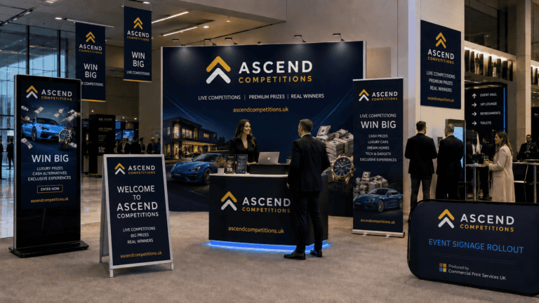
- Featured graphics should show display boards, POS panels and banners working as one system.
Building a Cohesive Brand Identity for Ascend Competitions
Start by fixing the core visual assets before any event material goes to print. That step keeps every large display graphic, point-of-sale panel and banner aligned with the same colours, type, spacing and logo treatment.
For New UK Competition Websites, the rollout for Ascend Competitions centred on consistency across formats with very different viewing distances. Large display graphics need bold hierarchy and short copy, while POS displays need fast recognition at close range. Event banners sit between the two, so the artwork must scale cleanly without losing legibility or brand impact.
The featured image supports that rollout by showing the main physical touchpoints together rather than as separate items. That approach helps stakeholders review how the brand performs as a system, not just as isolated designs. It also reduces approval issues later, since print production, event setup and on-site branding all follow one clear visual standard.
Designing Large-Format Display Graphics for Maximum Event Visibility
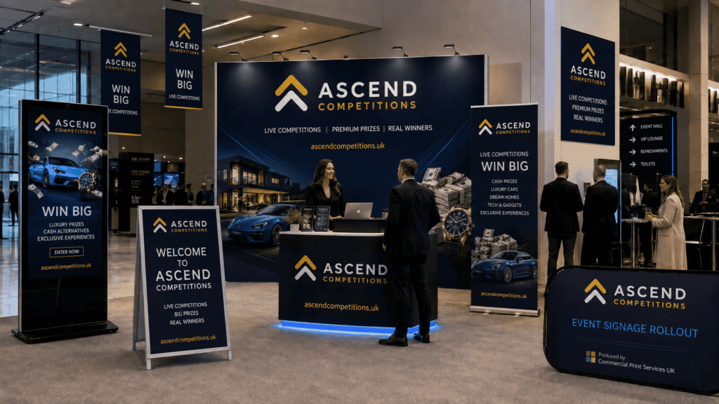
At viewing distances of three to five metres, short headlines, oversized logos and high-contrast colour blocks stay readable far better than dense promotional copy. That principle shaped the display work for Ascend Competitions, where the featured image focused on the formats with the biggest impact at events: large display graphics, point-of-sale panels and event banners.
The strongest approach is to design for distance first, then refine for close inspection. Clear hierarchy wins because visitors notice shape, colour and a few key words before they read detail. For printed stand assets, Large format Print supports bold branding, while Event Graphics help carry the same message across backdrops, pull-up banners and display panels.
Smaller text, finer product detail and longer promotional messages still have a place, but they work best on POS material viewed at close range. That split keeps event branding visible from a distance without wasting space on copy few people will read while walking past.
Creating POS Displays That Reinforce Trust and Drive Entries
Limited space is where many point-of-sale displays fail. Once too much copy, too many offers or weak hierarchy enters the layout, the display loses clarity at the exact moment it needs to prompt action.
That structure guides the build. Strong contrast separates the headline from supporting text, while consistent type sizes keep key details readable at close range. QR codes need clear quiet space around the edge, solid print density and placement away from folds, trims and reflective finishes. Logo positioning also needs discipline. Repeating it in one fixed location across panels, counter units and supporting signage reduces visual noise and helps the brand register faster.
The result is a display set that feels credible, organised and easy to act on. Shoppers can identify the brand, understand the offer and move to the entry step without searching for information. That consistency strengthens trust across every touchpoint, from countertop displays to wider event materials.
Aligning Website Visuals with Event Banners and Printed Materials
The website and printed materials must share the same visual system from the start. For Ascend Competitions, that means matching colours, type styles, logo scale and promotional hierarchy across banners, featured graphics and POS displays.
Build from one approved asset set, then adapt each layout to its viewing distance and format. Keep headline wording, prize imagery and call-to-action styling consistent, but adjust spacing, crop areas and text size for screens, banners and printed panels. Let the featured image guide the strongest large-format elements.
Problems start when web graphics introduce new colours, cramped text or altered logo treatments. Separate design files without shared rules also cause drift, especially when artwork moves from screen mock-ups to print.
Using Featured Graphics to Present the Full Brand Rollout
Strong featured graphics improve recognition at once and prevent the rollout from feeling fragmented across web, print and live events.
That means placing the largest display graphics first, then supporting them with POS panels and event banners in one clear visual hierarchy. The image should show how colour, logo weight, headline style and promotional emphasis stay consistent across each format. Wide-format assets carry the strongest visual signal, so they anchor the composition, while smaller POS elements confirm that the same identity holds up in close-range applications.
This approach gives the website a stronger opening impression and helps visitors connect the online brand with what they will see at events. It also turns a single featured image into proof that the rollout extends beyond the site itself and has been built for real-world use.
Frequently Asked Questions
What does a full brand rollout for a new competition website include?
A full brand rollout covers the core assets needed to launch consistently. This includes logo use, colour palette, typography, tone of voice, website visuals, and branded page elements such as banners, icons, and calls to action. It often extends to social profiles, email templates, and basic brand guidelines for future updates.
How do event banners and point-of-sale displays support a new competition brand launch?
Event banners build broad visibility, while point-of-sale displays drive action at the moment people engage with the promotion. Used together, they give a new competition brand both reach and immediacy.
Banners reinforce the name, colours and message across venues. Point-of-sale displays add clear entry instructions, deadlines and prizes, which helps lift recognition and response.
Why should display graphics match the branding of a competition website?
Match display graphics to the website’s branding from the start. Consistent colours, fonts and imagery make the competition look credible and easier to recognise across ads, landing pages and social posts. That consistency also reduces friction, so visitors feel they have reached the right site and can enter with more confidence.
How can featured imagery highlight key assets in a competition brand rollout?
Featured imagery must stay consistent with brand colours, typography and tone. Use it to draw attention to the prize, entry deadline or standout benefit first. Keep layouts clean, crop images for quick recognition, and make sure assets stay sharp across desktop and mobile.
What should businesses consider when planning branded materials for competition events and promotions?
Three factors shape effective branded materials: consistency, timing and compliance. Keep logos, colours and messaging aligned across entry pages, emails, social posts and physical assets so the promotion feels credible. Order print items early, match them to the audience and venue, and check competition terms, prize details and data protection wording before release.